
Hey designers!
Are you looking for some game-changing Figma plugins?
Figma stands out as a versatile tool that empowers designers to bring their visions to life with efficiency and creativity. One of the platform’s strengths is its extensive library of plugins, which further enhances its capabilities.
So, whether you’re an individual creator or work in a UI/UX design company, you need plugins that are enchanter for design tasks.
Here, we explore 25 essential Figma plugins that every designer should consider incorporating into their workflow. Each plugin is accompanied by a brief overview and an explanation of how it works, offering insight into its utility and application.
-
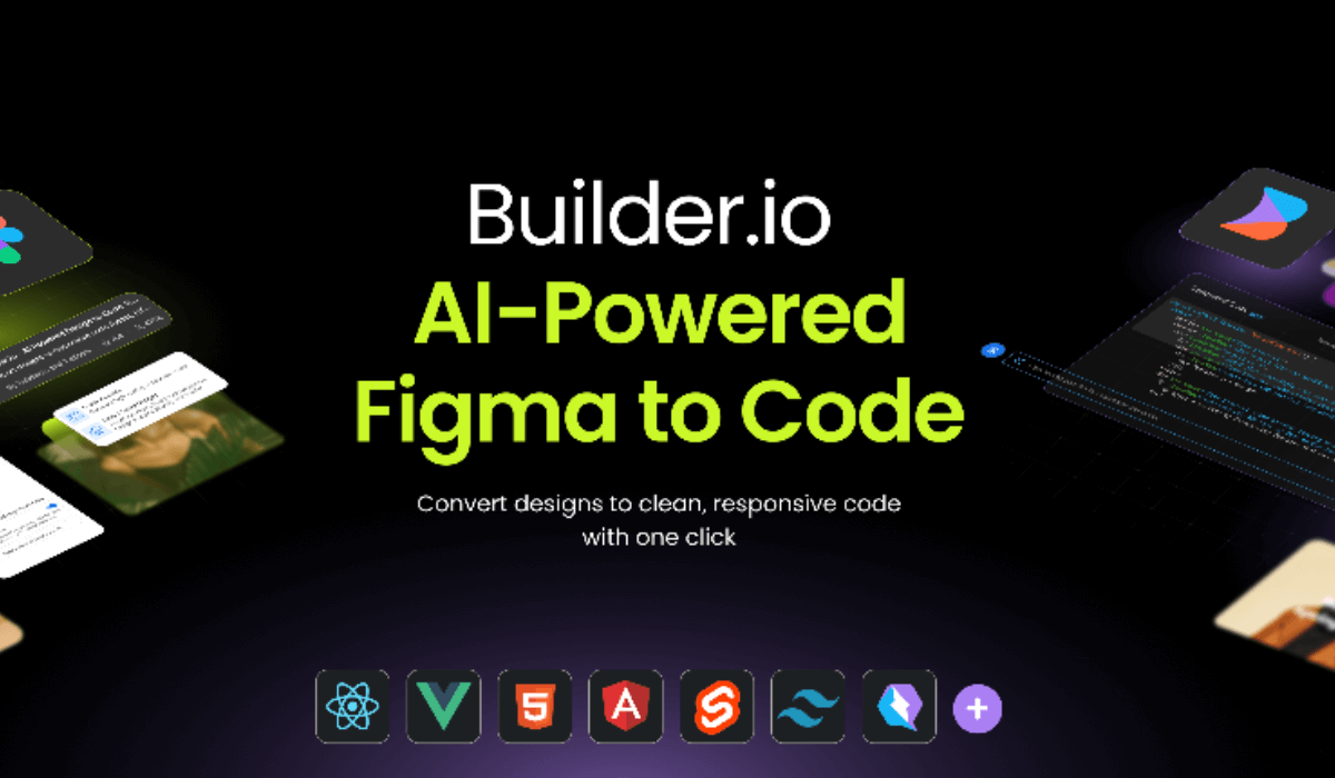
Builder.io
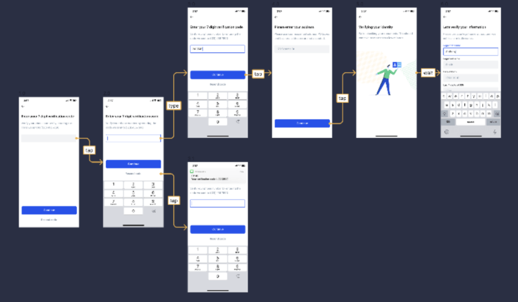
Overview: Builder.io integrates Figma designs directly into web and mobile development environments, bridging the gap between design and development.
Functionality: It converts Figma designs into code, allowing for seamless collaboration between designers and developers.
Application: Essential for teams looking to streamline the handoff from design to development, ensuring that designs are accurately translated into functional products.
-
Product Planner
Overview: Product Planner is designed for meticulous organization and visualization of projects. It’s an essential tool for designers who juggle multiple product features or complex interfaces.
Functionality: This plugin assists in mapping out project structures, and categorizing screens, components, and user flows. It facilitates a comprehensive view of the project’s architecture, making it easier to navigate and manage.
Application: Use it in the early stages of product development to structure your workflow and throughout the project to keep your product design organized.

-
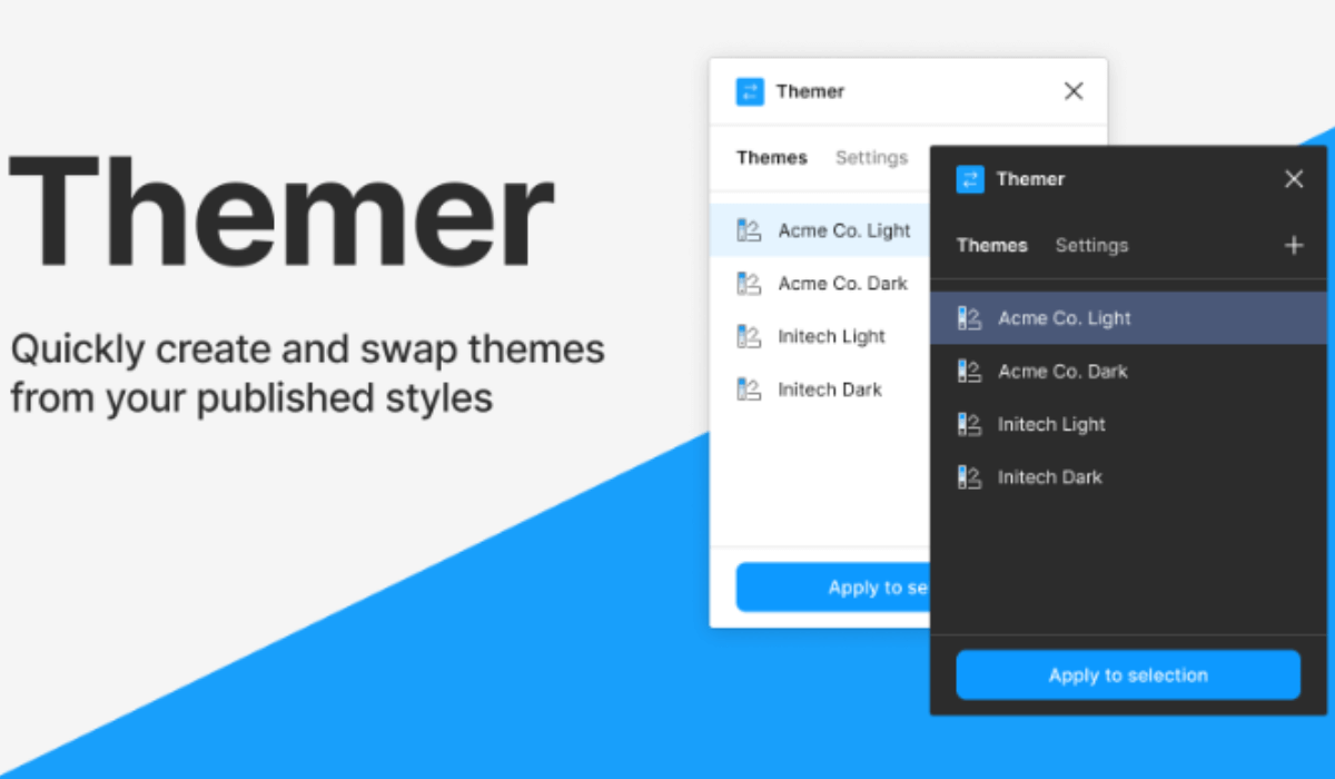
Themer
Overview: Themer is a Figma plugin that provides a solution for creating and managing design themes, allowing designers to easily switch between light and dark modes or different color schemes across a project.
Functionality: It enables the creation of multiple theme styles that can be applied globally to a design, ensuring consistency and saving immense time during the design process.
Application: Essential for products that offer multiple theme options, ensuring a cohesive look and feel across all user preferences.
-
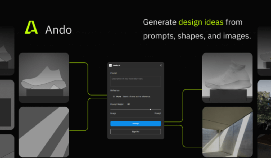
Ando
Overview: Ando is a utility plugin that offers a collection of design tools and shortcuts, designed to improve efficiency and workflow.
Functionality: From color adjustments to layout alignments, Ando provides a toolkit that simplifies common design tasks.
Application: A valuable resource for any designer looking to speed up their design process without sacrificing quality.
-
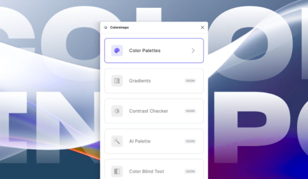
Color Palettes
Overview: Color Palettes revolutionize the way designers interact with color schemes, making it easier than ever to find and apply beautiful, cohesive palettes directly in Figma. This plugin is a godsend for those striving to create designs with perfect color harmony.
Functionality: It analyzes existing elements in your design to suggest complementary colors, or you can explore and apply pre-defined palettes based on color theory. This not only saves time but ensures your designs are visually appealing.
Application: Ideal for branding projects or any design requiring a unique and consistent color scheme. It eliminates the guesswork in color selection, empowering designers to create with confidence.
-
Autoflow
Overview: Autoflow is a Figma plugin that simplifies the creation of flowcharts and user journey maps, turning what could be a tedious process into a seamless, enjoyable task. It’s indispensable for UX/UI designers who map out complex processes.
Functionality: By selecting two objects, Autoflow draws an arrowed line to connect them, making it easy to visualize user flows or software architectures. This automatic connection saves significant time and maintains a clean, professional look.
Application: Perfect for presentations, brainstorming sessions, and documentation. Autoflow helps in creating clear and informative flowcharts that enhance communication within and across teams.
-
Remove BG
Overview: Remove BG is a quick fix for isolating subjects from their backgrounds in images. This plugin uses advanced algorithms to detect and remove backgrounds, making it an essential tool for designers who work with images frequently.
Functionality: With just a click, it precisely removes an image’s background, saving hours you would otherwise spend on manual editing. The plugin supports a range of image types, offering flexibility in its use.
Application: Ideal for marketing materials, website design, or any project requiring clean, professional-looking images without the hassle of manual editing.

-
Figmotion
Overview: Figmotion introduces animation capabilities directly within Figma, enabling designers to bring their creations to life without needing specialized animation software.
Functionality: It offers a simple timeline and keyframe interface, allowing for the animation of any design element. Export options include GIFs or video files, making it versatile for different mediums.
Application: Use Figmotion to create dynamic prototypes, add engaging animations to web or mobile designs, or simply to experiment with motion design in your projects.

-
Brands Colors
Overview: Brands Colors is a quick reference tool for designers needing accurate brand color codes. This plugin ensures brand consistency by providing easy access to an extensive library of official colors from globally recognized brands.
Functionality: It’s a simple yet powerful tool that allows designers to search and apply brand-specific colors to their designs, ensuring that all creative outputs adhere to brand guidelines.
Application: Essential for advertising, brand management, and marketing projects where precise color representation is critical for brand identity.

-
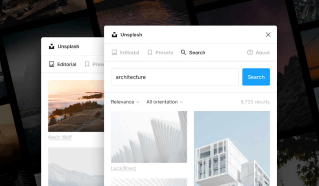
Unsplash
Overview: Unsplash offers direct access within Figma to a vast library of free, high-quality images. This integration makes it incredibly easy to find and use stunning photography without leaving your design environment.
Functionality: You can search, preview, and insert images directly into your designs. This seamless integration saves time and enhances the visual quality of any project.
Application: Perfect for any project that could benefit from high-quality images, from web design to marketing materials, without worrying about copyright issues.
-
Mapsicle
Overview: Mapsicle is a game-changer Figma plugin for designers needing to integrate maps into their projects. It offers extensive customization options, making generic map embeds a thing of the past.
Functionality: Customize the location, appearance, and zoom level of maps directly within Figma, creating dynamic, interactive map experiences for your designs.
Application: Ideal for projects requiring maps, such as event invitations, apps with location features, or any digital product that benefits from geolocation.
Hire a professional UI/UX design company in Kolkata to enhance your website-building journey.
-
Responsify
Overview: Responsify aids in the creation of responsive designs, providing tools to test and adjust designs across various screen sizes and devices.
Functionality: It offers a range of preset device sizes, but you can also define custom sizes. This flexibility ensures that designs look great on any screen.
Application: A must-use for web and mobile designers, ensuring that designs are not only aesthetically pleasing but also functional across different devices.

-
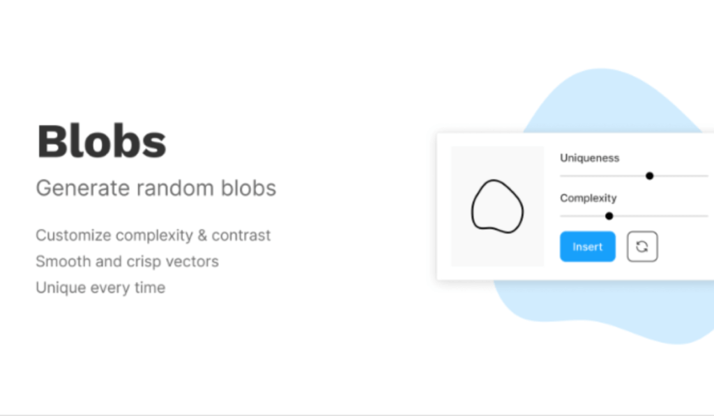
Blobs
Overview: Blobs is a Figma plugin that offers a unique way to create organic, blob-shaped backgrounds and elements, injecting a playful, dynamic aesthetic into designs.
Functionality: It generates customizable, scalable vector blobs that can be modified in terms of complexity, contrast, and color. This plugin allows for the creation of unique, eye-catching designs with just a few clicks.
Application: Perfect for creating engaging backgrounds, standout web elements, or unique branding materials that require a touch of creativity and differentiation.
-
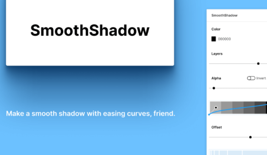
SmoothShadow
Overview: SmoothShadow elevates the visual depth of designs with its ability to create more nuanced and natural-looking shadows, far surpassing the basic shadow options in Figma.
Functionality: It allows for fine-tuning shadow properties such as color, opacity, blur radius, and x/y offsets, enabling designers to craft perfectly soft, smooth shadows.
Application: Ideal for UI elements, cards, and modal windows, where a subtle shadow effect can greatly enhance the visual hierarchy and aesthetics.
-
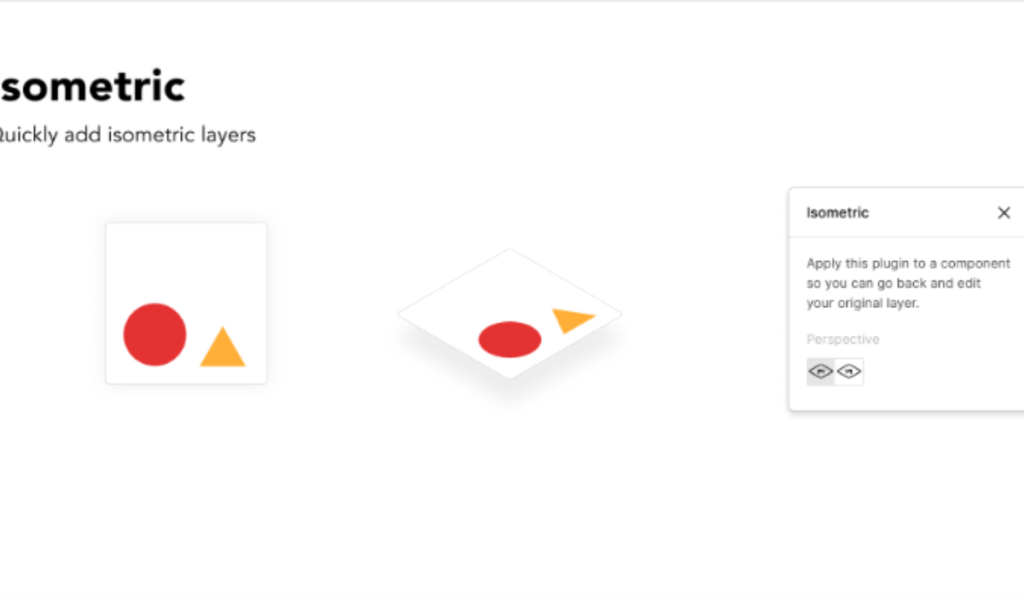
Isometric
Overview: Isometric transforms flat designs into isometric art, allowing for the creation of 3D-looking visuals without needing specialized 3D modeling software.
Functionality: This plugin automates the process of skewing and scaling elements to fit an isometric perspective, making it easy to create complex isometric illustrations.
Application: Use it to add depth to illustrations, create isometric icons, or enhance presentations and infographics with 3D-like visuals.
-
Content Reel
Overview: Content Reel assists in populating designs with realistic text, images, and avatars, streamlining the design process and enhancing the final look with minimal effort.
Functionality: It sources content from a vast library or allows you to create custom reels, ensuring that placeholders reflect the final content’s look and feel.
Application: Essential for prototyping and final designs, allowing for a more accurate representation of how a project will look with real content.

-
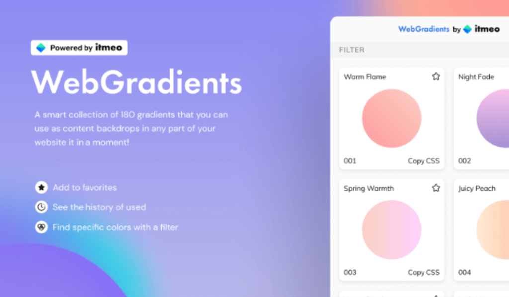
Webgradients
Overview: Webgradients brings a collection of beautiful, web-ready gradients directly into Figma, perfect for adding vibrant backgrounds and elements to your designs.
Functionality: With a simple interface, it allows designers to explore, preview, and apply gradients, boosting the visual impact of any project.
Application: Ideal for backgrounds, buttons, or any design element that could benefit from a touch of color and depth.
-
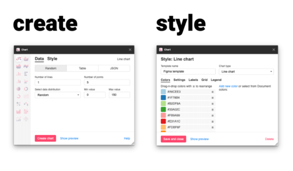
Chart
Overview: Chart is a Figma plugin that simplifies the creation of data visualizations within Figma, making it easy to transform data into beautiful, informative charts.
Functionality: It supports various chart types and allows for the customization of data points, making it versatile for all kinds of data representation needs.
Application: Perfect for infographics, dashboards, presentations, or any project that requires clear and compelling data visualization.
-
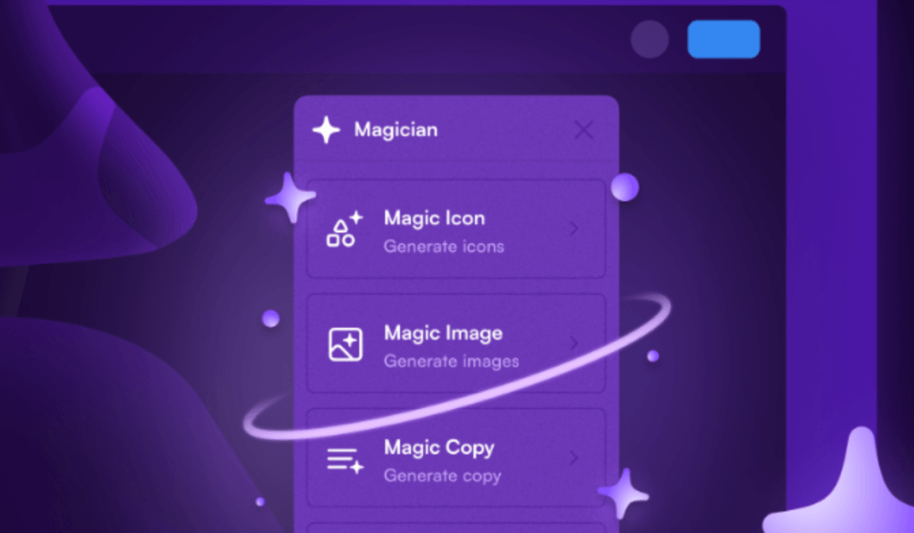
Magician
Overview: Magician offers a suite of tools to enhance the functionality of Figma, including automation scripts and shortcuts that streamline repetitive tasks.
Functionality: From batch renaming layers to quick layout adjustments, Magician equips designers with the tools to work more efficiently and focus on creativity.
Application: Ideal for designers looking to optimize their workflow and reduce time spent on manual adjustments.
-
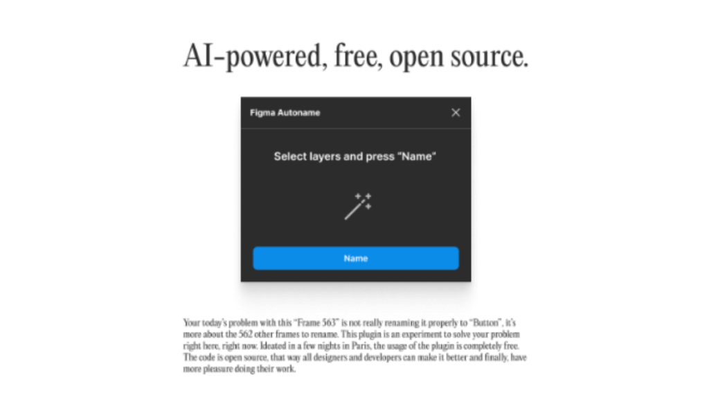
Figma Autoname
Overview: Figma Autoname saves time and ensures consistency by automatically naming layers and frames based on customizable rules.
Functionality: This plugin eliminates the tedious task of manually naming elements, allowing for a more organized and manageable workspace.
Application: Essential for large projects or teams that require a systematic naming convention to maintain order and efficiency.
-
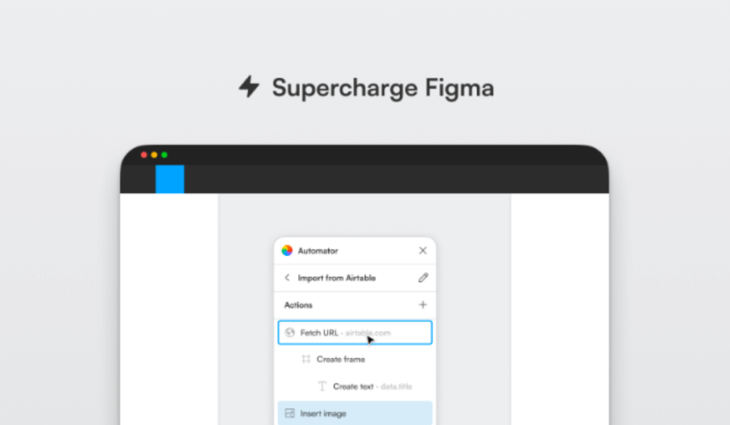
Automator
Overview: Automator lets you create and run custom automation scripts within Figma, transforming repetitive tasks into one-click actions.
Functionality: It can automate a wide range of tasks, from layer adjustments to exporting assets, significantly speeding up the design process.
Application: Perfect for designers who frequently find themselves performing the same actions and looking for ways to streamline their workflow.
-
Wireframe Designer
Overview: Wireframe Designer is a comprehensive toolkit for quickly creating high-fidelity wireframes, offering a wide range of UI elements and icons.
Functionality: This plugin provides everything needed to create detailed wireframes, from navigation bars to form elements, all customizable to fit any project.
Application: Ideal for UX/UI designers in the early stages of design, enabling rapid prototyping and conceptualization.

-
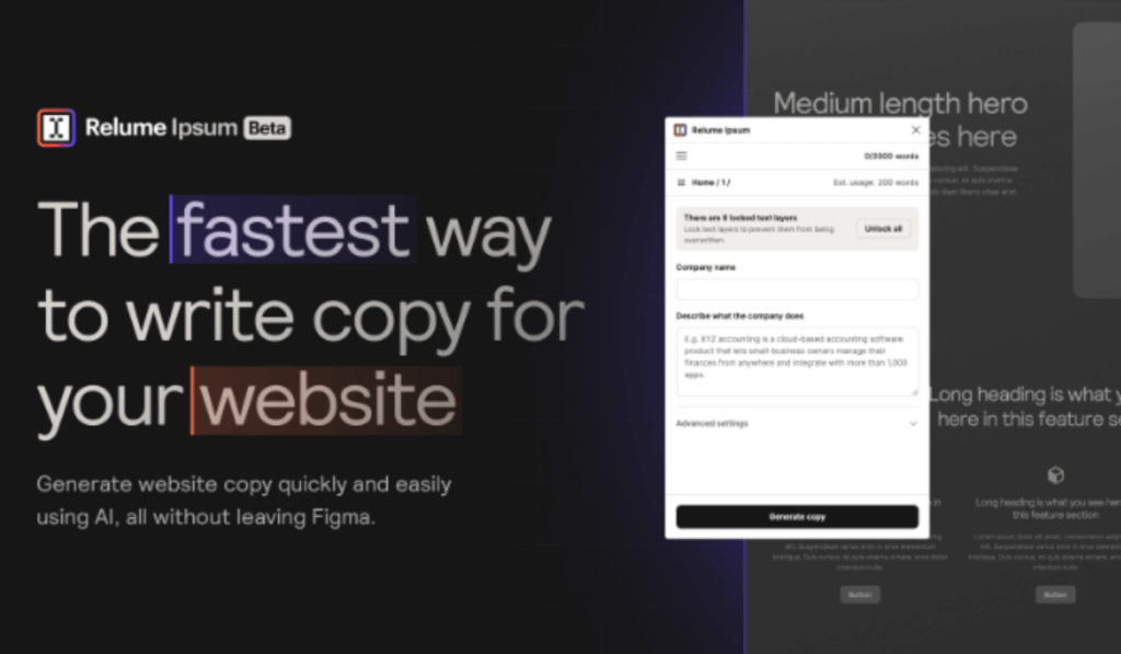
Relume Ipsum
Overview: Relume Ipsum is another Figma plugin that replaces the traditional Lorem Ipsum with more meaningful placeholder text, tailored to the context of your design.
Functionality: It generates placeholder text that closely resembles final content, providing a more accurate representation of text layouts.
Application: Use it to enhance the realism of prototypes and mockups, particularly useful in user testing and client presentations.
-
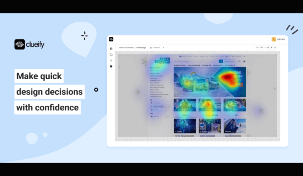
Clueify
Overview: Clueify offers insights into how users interact with design prototypes, providing valuable feedback for iterative design improvements.
Functionality: It tracks clicks and engagement within prototypes, helping designers understand user behavior and preferences.
Application: Essential for UX research and testing, allowing designers to make data-driven decisions to improve usability and user experience.
-
Magestic
Overview: Magestic brings advanced typographic controls to Figma, enabling designers to fine-tune text with precision and creativity.
Functionality: It expands on Figma’s native text options, offering additional controls for letter spacing, line height, and other typographic adjustments.
Application: Perfect for designers who are particular about typography and want to achieve the perfect text layout and readability.
Conclusion
These plugins represent just a fraction of what’s available on Figma, but they stand out for their ability to streamline processes, enhance creativity, and facilitate a more efficient design workflow. Every above-mentioned Figma plugin offers unique capabilities to enhance the design process, whether through automation, efficiency improvements, or creative expression. By incorporating these tools into your arsenal, you can significantly improve the quality and speed of your design projects.